Designing a professional wedding album is one of the most important and complicated phases of the photography process. Not only does it take a lot of time (and who has it?) but also a lot of attention to detail: a small oversight, in fact, can ruin the outcome.
Imagine you have captured the emotions of that special day with your photographs, you’ve chosen - together with your clients - a handcrafted design cover that enhance the elegance of your images and then, flipping through the album, you realize you’ve cut the groom’s head off. Disaster.
Not following the trim indications may seem a rookie mistake but it often happens. Flipping through hundreds of pages per day we’ve gathered the 5 things not to do when you design a professional wedding album:
1. Beheading
Cutting off the heads of the bride and groom or the guests is not nice. However, it is common to not take into account the trim area or to insert a full spread photo and place the couple’s faces exactly on the crease with a macabre result.
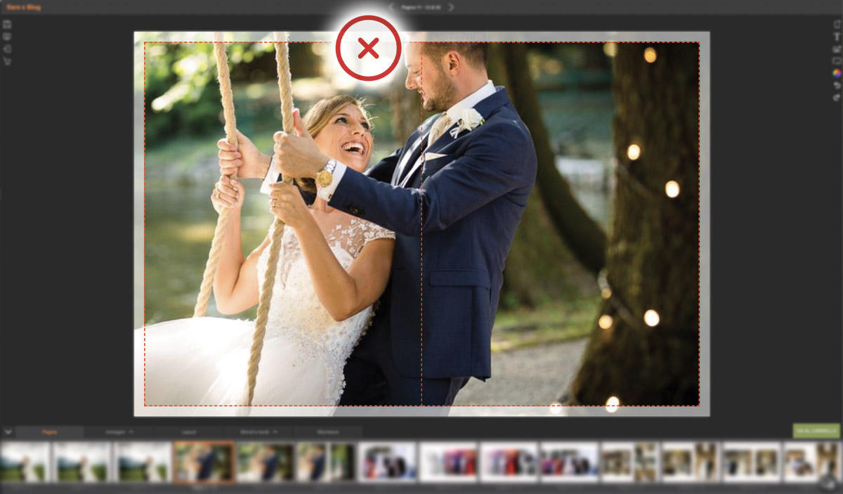
Tip: always activate the trim area while placing your images; in our online editor AE Veloce it’s always visible and marked in red to discourage you from taking up the career of a professional executioner.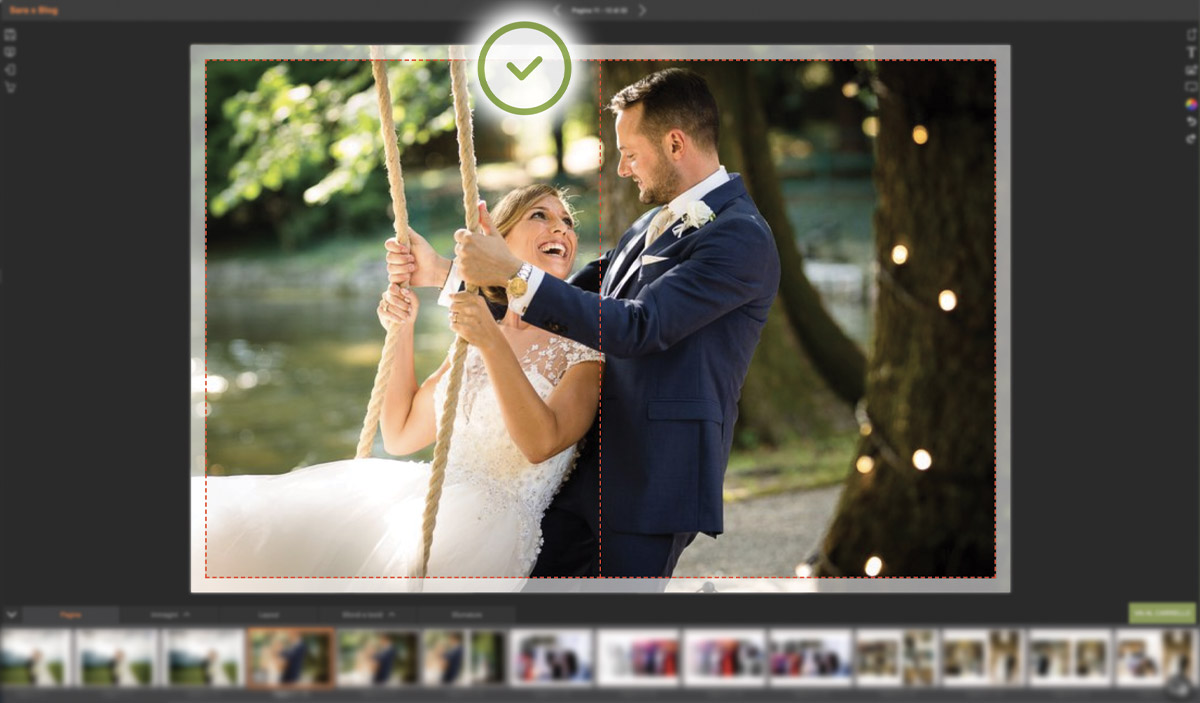
2. Dalì style post-production
The surrealism path is not the one to follow when you want to design a wedding album that tells events which are related to each other, even visually.
When it’s not coherent, post-production becomes chaotic and disconnected as if the pages were telling different stories. To give uniformity it is essential to create a chromatic harmony that connects all of your images.
Tip: to visually connect the images, highlight the colors that are in harmony with each other, while to create a coherent storytelling, page after page, use nuances and backgrounds.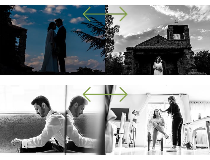
3. Using standard layout
The layout, along with your images, defines your photography style. Creating a custom layout with shades and backgrounds helps you differentiate your work from your colleagues. Let yourself get inspired by our styles.
Tip: To save time, create a layout to start from and customize it following your style and the one of your photos. In AE Veloce you can find many layouts and tools to make it in your image and likeness.
4. Telling a confusing and boring story..
If an album is a story, it has to be a good one: pleasant and easy to read. If you don’t want to bore your readers it’s important to give rhythm and movement to the design; you can achieve this by telling the most salient and emotional moments of the wedding day.
Tip: follow the stages of the ceremony to tell a coherent and interesting story. In addition, you can alternate full-page photos and reportage photos or even fade the images in to create movement and softness.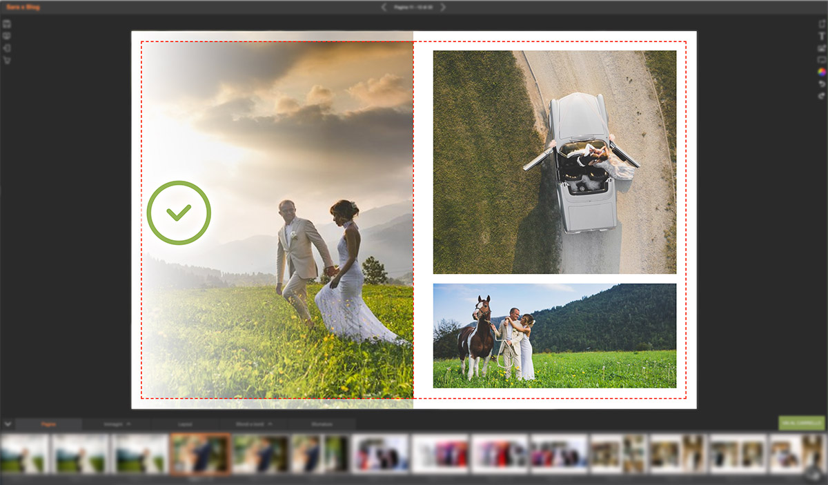
5. ...or too detailed
When it comes to design, less is more: cramming the spaces with details and colors in contrast with the chosen style weighs down the reading. A clean background - white, black or a full color that recalls the environment - helps create the right harmony. 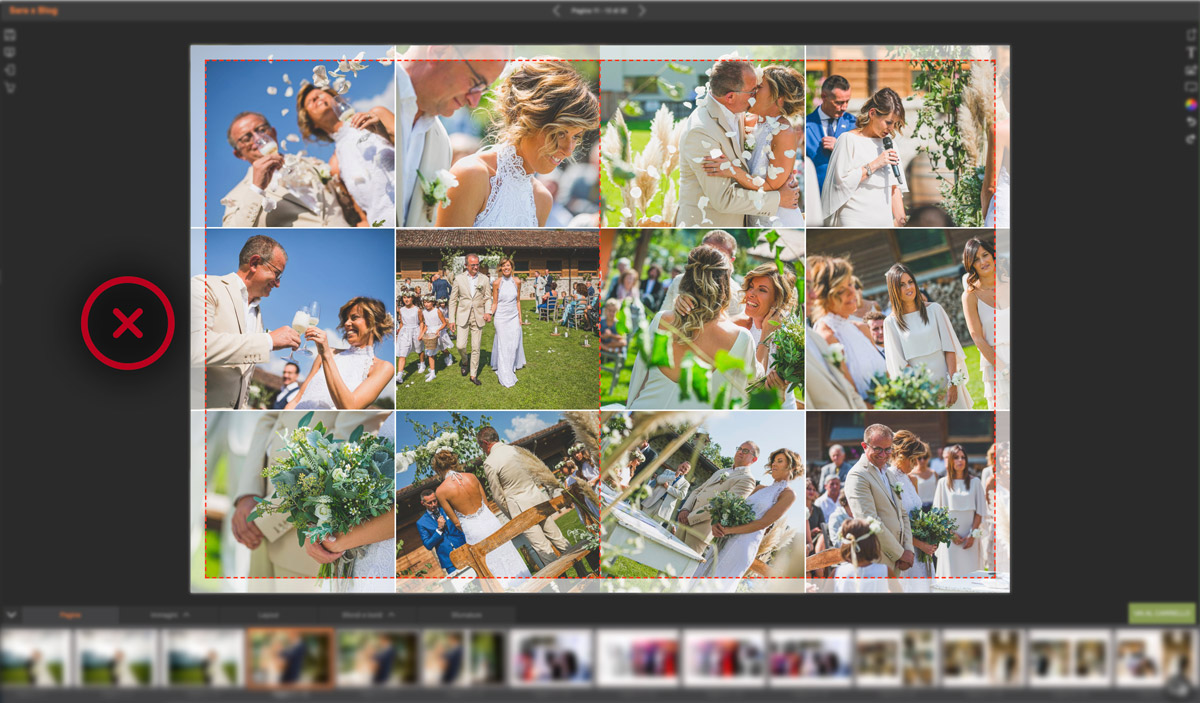
Tip: white is your friend, use it to give images space to breathe.
Now that you know what you shouldn’t do to design a professional album, you’re ready to use our online design software AE Veloce, where you find all the tools to express your creativity and create a distinctive style. It’s so easy and intuitive that you can’t go wrong! But if you really don’t like the design process, we have a team of expert graphic designers who will do it for you, gladly and for free - for now!



Comment